Ubuntu 22.04 is just a few weeks from release, and those who upgrade from the previous long-term support (LTS) release will find that much has changed — more so than they might first think.
In addition to all the (many) new features introduced as part of Ubuntu 22.04, LTS users will finally get to benefit from the cumulative changes shipped in Ubuntu 20.10, 21.04 and 21.10.
And to help bring LTS to LTS upgraders up to speed I’ve put together the following guide. In it, I detail 20 new features, changes, and improvements to look out for in Ubuntu 22.04 LTS ‘Jammy Jellyfish’.
This is by no means exhaustive. Only some of the changes mentioned below are specifically new in 22.04, the rest were introduced in earlier builds but are ‘new’ to LTS upgraders. If you ride the interim releases (like I do) then the majority of this list will be familiar.
Waffle done, let’s dive in!
20 Changes Between 20.04 and 22.04
1. Wayland by Default
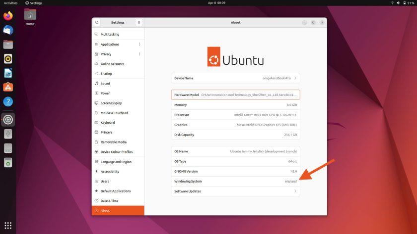
Wayland is the default display server in Ubuntu 22.04 LTS — but don’t panic: it’s 2022 and Wayland is pretty solid these days. Plus, thanks to technologies like Pipewire, even previously tricky areas like screen sharing work out of the box, and without fuss under Wayland.
Heck, in Ubuntu 22.04 Wayland is so robust it even ships as default for computers for those with select NVIDIA graphics cards.
But if you find your hardware, an app, or your overall experience doesn’t play nice in Wayland just log out and select the ‘Xorg’ session from the login screen instead — it’s still there, and still fully functional. The only thing you’ll miss out on are the new touchpad gestures (see #9 on this list).
2. A Light Default Look
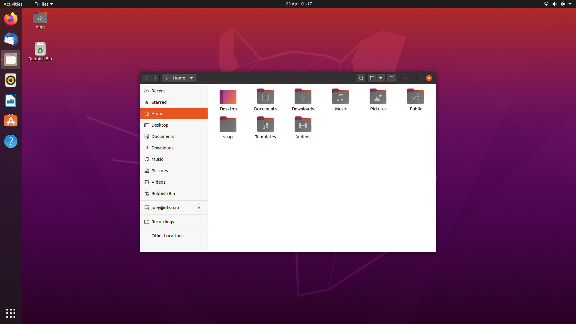
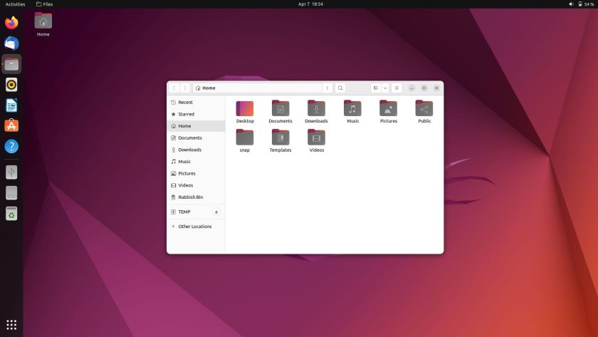
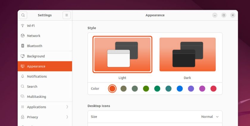
Focal fans will certainly notice that Ubuntu’s appearance has evolved in the intervening years. The Yaru GTK theme has dropped the “mixed” theme (dark header bars and light controls) in favour of a fully light theme.
The window ‘close’ button is no longer denoted by a bright red dot. Instead, echoing the look of libadwaita in vanilla GNOME 42, Yaru puts subtle grey “backdots” behind all three window controls.
You probably wouldn’t notice this unless I pointed it out: many of Ubuntu’s default apps have rounded bottom corners. These help give the distro a softer vibe compared to the sharp jagged window corners found in the Focal Fossa.
3. More Compact Desktop UI
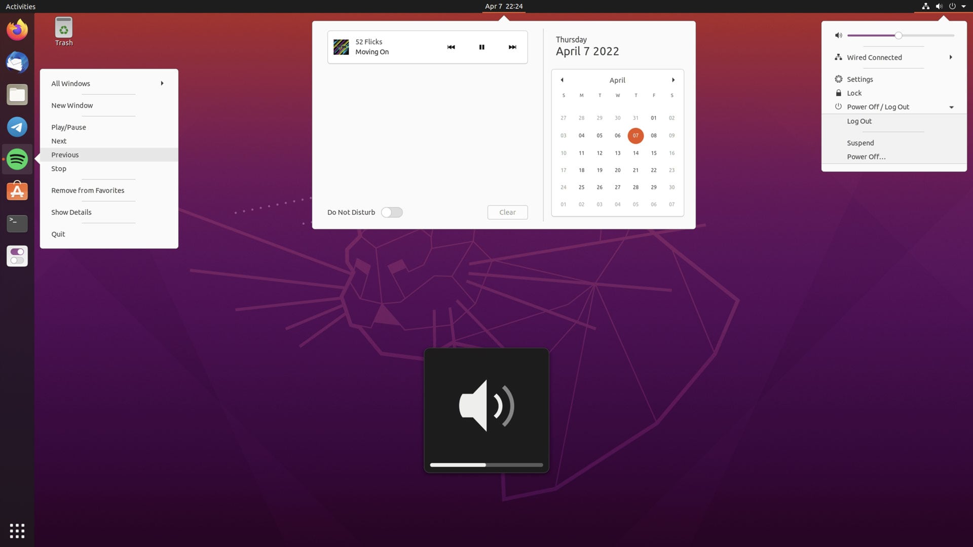
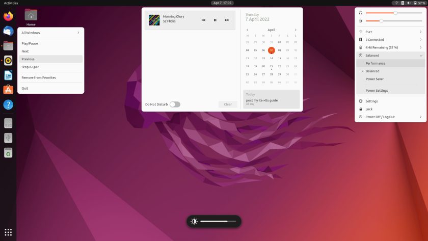
Ubuntu 22.04 looks more ‘compact’ than before thanks to upstream design changes within GNOME Shell.
Panel applets, pop-overs, and menus use tighter margins, bringing items closer to their origin point; padding within menus is reduced; and OSDs (e.g., volume, brightness, etc) have been overhauled to be less conspicuous.
4. Improved Desktop Icons Experience
Ubuntu has switched to a better desktop icons extension than the one found in Ubuntu 20.04, something upgraders trying will find a revelation. You can —yes, in 2022— finally drag and drop files and folders out of the file manager and on to the desktop, and vice versa.
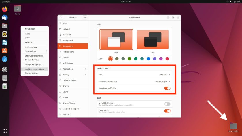
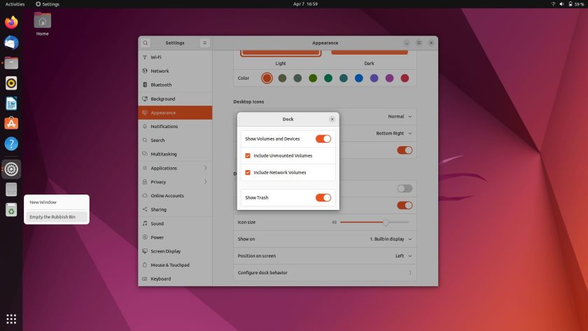
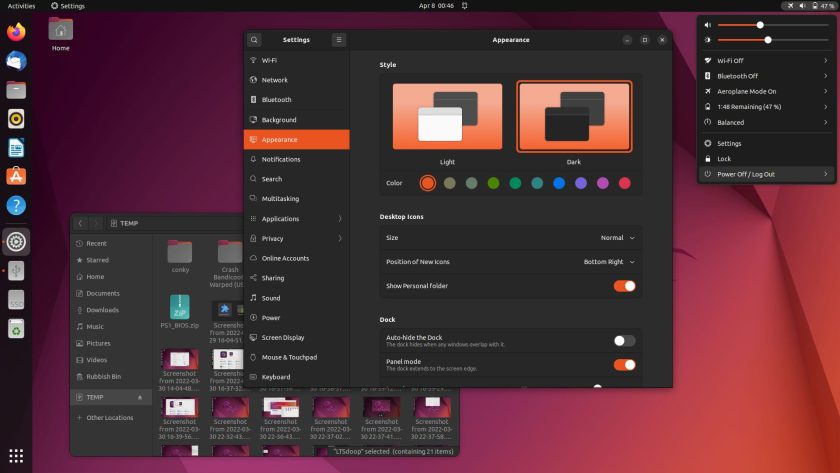
A handful of desktop icons settings are available through the (newly improved) Appearance panel in System Settings.
Oh, and a change I keep forgetting to mention: new folders added to the desktop appear in the bottom right corner by default, and not in the upper left. A bit of a peculiar change, but configurable thanks to those aforementioned settings.
5. Horizontal Workspaces

Workspaces in Ubuntu 22.04 are added/managed horizontally rather than vertically. Workspaces remain dynamic (and there are new multi-tasking settings we’ll talk about a bit later) but page from left to right.
You can access the workspace switcher by hitting the super key once, or by clicking the “activities” label in the top left-hand corner. Alternatively, you can invoke the workspace at any point by using new multi-touch gestures (see #X, below).
Each time you drag/open a window on the furthest workspace a new one is created after it. When you close all windows in a workspace that workspace will vanish when you switch away.
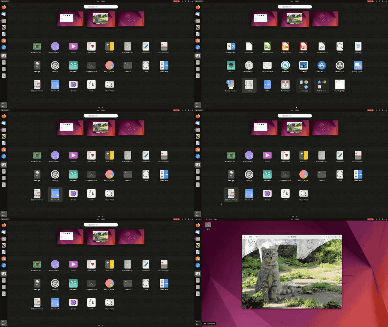
When more 2 or more workspaces are in use you can access and interact with a thumbnail-sized workspaces from the application launcher, which…
6. App Launcher Changes
…is also horizontal, matching the orientation of the workspace switcher.
In Ubuntu 22.04 the full-screen launcher slides up from the bottom of the monitor and pages from left or right. In 20.04 the app launcher “swarmed” from the lower-left hand corner and slid up and down.
There are some other quality improvements that make the experience of using the app launcher more pleasant, including the ability to freely rearrange app shortcuts (just drag and drop icons to reorder them however you like) and truncated/ellipse’d shortcut names showing in full when you mouse over them.
7. Dock Differences
A few tweaks to the Ubuntu Dock are present. You can’t fail to notice that a trash can item now sits in the dock rather than on the desktop, while a new divider separates running app icons from pinned app icons.
More dock settings are available in the System Settings > Appearance section, including a switch to turn off panel mode (i.e. and get more of a dock look); options for what should or shouldn’t show in the dock; and choices for how the dock behaves with multi-monitor setups.
8. Accent Colours
Ubuntu has replaced most of the aubergine/purple accents in the Yaru theme with orange ones. But if you don’t like orange you’re in luck; Ubuntu 22.04 lets you choose from 10 different accent colours. These affect the GKT theme, GNOME Shell theme, and even some icons.
9. Touchpad Gestures
New touchpad gestures are available in Ubuntu 22.04 LTS’s default Wayland session for opening and closing the workspace switcher and application launcher, and paging through them.
A three-finger swipe on a compatible multi-touch touchpad engages the workspace switcher, while a further three-finger push reveals the application launcher. You can use a two-finger swipe to page left/right.
What I really like about these new gestures is that the gesture animations are 1:1 — they happen as fast (or as slow) as your hand movements. It might not sound it, but this is real “cherry on top” enhancement that makes Ubuntu feel more like a polished and cohesive whole.
This is a hard ‘change’ to convey via a written post, so look out for a hands-on demo in the Ubuntu 22.04 release video on the omg! ubuntu! YouTube channel.
10. Password Protected Zips
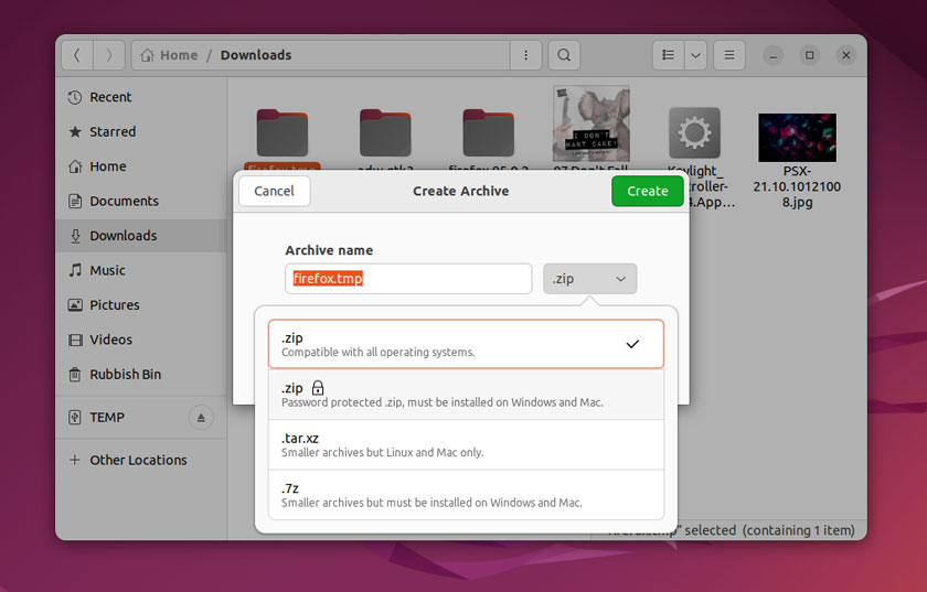
Ubuntu’s default file manager has learnt a things since Focal days. It can now extract password protected .zip archives directly (using the right-click > extract here option).
You can also create password protected .zip files in Nautilus too. Right-click on a folder and choose the Compress followed. In the option box that appears choose the password protected zip option, then enter a password, and away you go.
11. Muted Microphone Alert
Ever been in the middle of a Zoom call, Skype chat, or Discord debrief and not noticed your microphone is muted? Ubuntu 22.04 (though more technically GNOME 42) has a handy helper: when a call is active your microphone status is displayed in the top bar. When your mic is muted you’ll see a greyed out motif, letting you know NO ONE CAN HEAR YOUR, KAREN.
12. Calendar Events in Notification Area
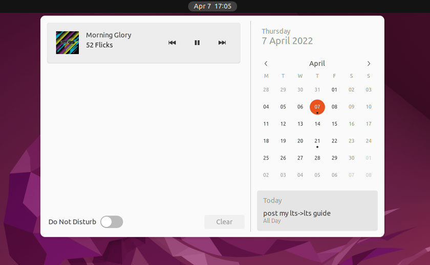
Events from the Calendar app appear in the notification shade/clock applet. By default you’ll see all events on the current day, but you can see events on other days by select a date in the calendar. If an event is scheduled on that day it’ll have a little ‘dot’ icon underneath, and then preview the event in a card beneath the calendar.
13. Power Options
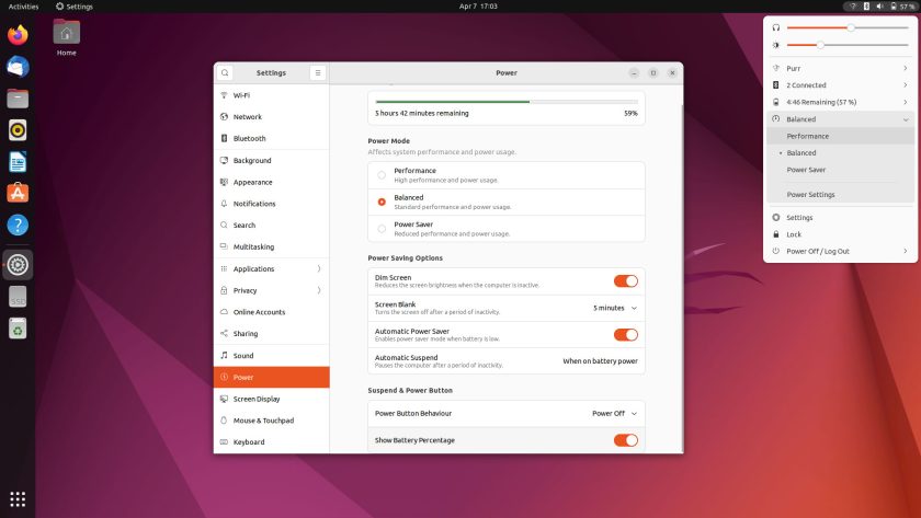
Ubuntu 22.04 ships with a slew of new power management features including three power modes: ‘power saver’, ‘balanced’, and (hardware dependant) ‘performance’. Modes can be set/accessed via the Power panel in System Settings, or selected from the new power section in the main Status Menu.
On portable devices Power Saver mode is activated automatically when the battery level is low. There’s no direct GUI way to choose how low the battery needs to be before it kicks in but a gsettings level can be set via the command line.
Related to battery…
14. ‘Show Battery Percentage’
It’s taken Ubuntu a ridiculously long time to make this very basic option available to users, out of the box, no tweaks tools or customisation scripts required. Does what it says on the tin: shows battery percentage in the top bar, where it should.
15. Prominent Restart Option
As we’re on the topic of “things Ubuntu should’ve had sooner” here’s another one: there’s FINALLY a visible restart option in the session options in the Status Menu. It’s baffling how restart — something a lot of us do often, be it to access a dual boot or apply some kernel changes — was absent until now.
16. Keyboard Shortcut Settings

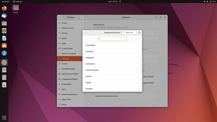
I don’t add or edit Ubuntu’s keyboard shortcuts often but hey: you might!
If so you’ll appreciate the overhaul GNOME developers have given to the keyboard shortcuts settings page. It’s now a sub-section of keyboard settings and is better organised, faster to scan, and (hurrah) totally searchable! Finding a specific keybinding to tweak is easier than ever.
17. Multi-tasking options
A swathe of multi-tasking options are accessible in the System Settings app.
Here you get to choose whether to use dynamic workspaces (created on demand) or stick to a fixed number; you can disable the hot corner that triggers the workspace switcher; and choose to disable window snapping (though why? it’s handy).
18. New Screenshot Tool
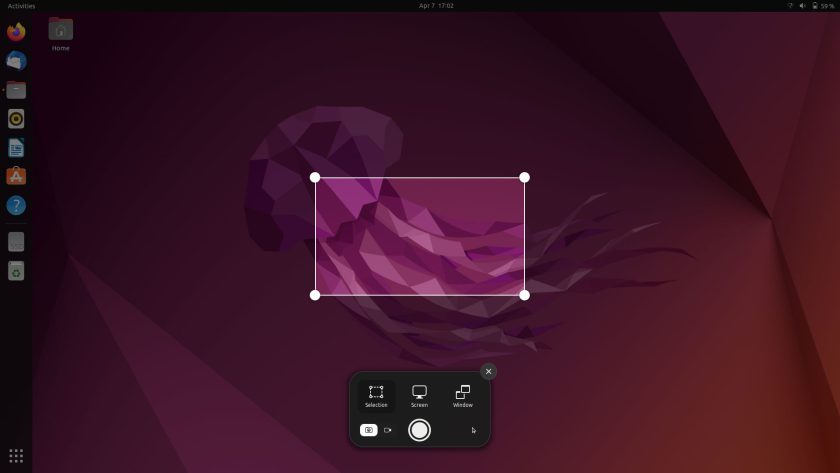
Taking a screenshot in Ubuntu is now a lot better. Hitting print screen in Ubuntu 20.04 just snaps the entire screen and saves it. In Ubuntu 22.04 hitting the same key opens an interactive screen snipping tool.
You can resize the on-screen handles to take a snap of a specific section; take a full-screen snap; or grab a screenshot of a specific window (tip: to do the last action faster right-click on an app’s title bar and select ‘take screenshot’).
You can also use the new interactive screenshot tool to take a screen recording, again of the whole screen, an area, or a particularly programme.
19. Proper Dark Mode
In Ubuntu 20.04 selecting the “dark” theme option in the Appearance panel doesn’t affect the GNOME Shell UI. The effect is that …half of the UI remains light when dark mode is enabled. Ubuntu 22.04 fixes that with a truly comprehensive dark theme that affects the entire UI, GNOME Shell included.
20. Oh, and Firefox is now a Snap
We end on the “controversial” one.
Look, Snaps are not the most popular packaging format. Any time I mentioned them the comments section quickly reheats the well-worn arguments for and against.
And yet, surprisingly, despite their rep Mozilla has chosen to distribute Firefox to Ubuntu users as a Snap app. A Firefox Snap was made default in Ubuntu 21.10, and (no surprise) it’s still default in 22.04 too.
When you upgrade from Ubuntu 20.04 LTS your existing .deb version of Firefox is swapped out for the Snap build. Some behind-the-scenes helpers handle the process of importing your bookmarks and preferences over, so you won’t notice much difference…
…Until you launch Firefox for the first time after a cold boot. It can take up to 10 seconds to actually open. The good news is that the slow start is temporary. The bad news is that it’ll be slow after the next cold boot. Faster Snap startups times have been ‘announced’ several times before, and yet…
This guide is by no means exhaustive. There are a ton of smaller changes — you can share Wi-Fi hotspots by QR code, for example — but these 20 changes are the ones I feel make Ubuntu easier to use, and in some cases a little more fun, too!






![10 exemples de commandes Gzip [Compress Files in Linux]](https://media.techtribune.net/uploads/2023/06/Gzip-Command-in-Linux-238x178.png)


