The Nothing Phone (2) is a smartphone from a company with huge ambitions and grand visions, and much of that narrative bleeds over into how people often talk about the device. After almost two weeks with Phone (2), though, I’ve really come away with just one conclusion – this is just a really good phone, nothing more.
Hardware
A unique look for a tried-and-true form factor
If you watch the launch film for the Phone (2), you’ll hear Nothing founder Carl Pei speak highly of the Phone (2) as a device that’s trying to make smartphones fun and exciting. And he’s right – most smartphone releases have gotten exceptionally boring over the past several years. But, where other brands are trying something new in foldables, Nothing is trying to make something unique out of the traditional smartphone form factor.
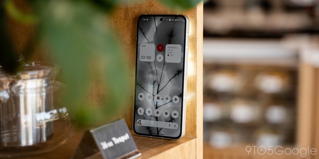
The key way it tries to do that is through design, and it’s safe to say that the Phone (2) carries a unique look.
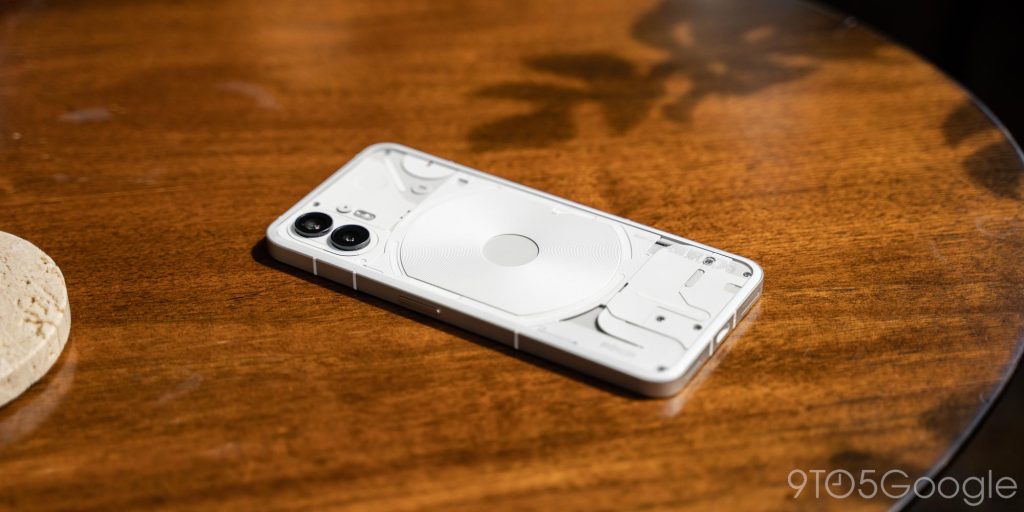
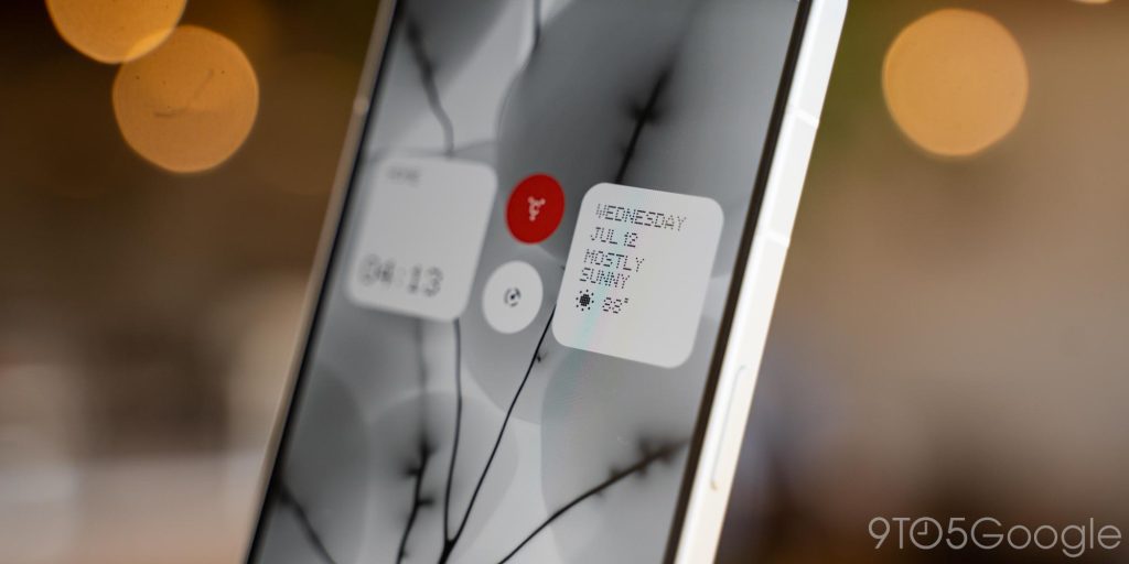
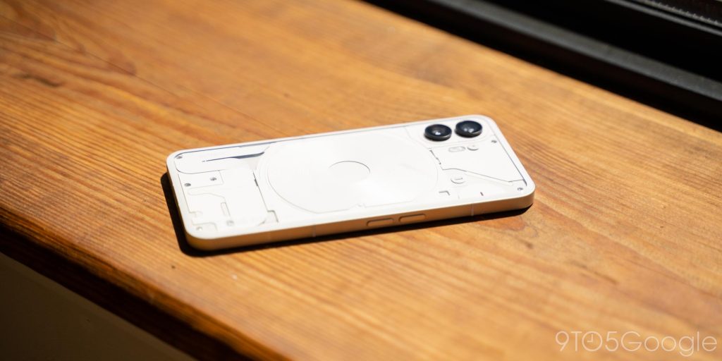
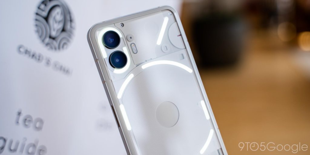
Like the Phone (1) before it, the signature trick of the Phone (2) is a backplate that’s designed to look transparent. You’re not actually seeing inside the phone but rather a customized 3D backplate that gives off the look of a much cleaner version of what the inside of a phone looks like. It’s a design that stands out and, really, is just super cool. I’m partial to the company’s classic white look, but the gray that our Max Weinbach has been using is equally cool.
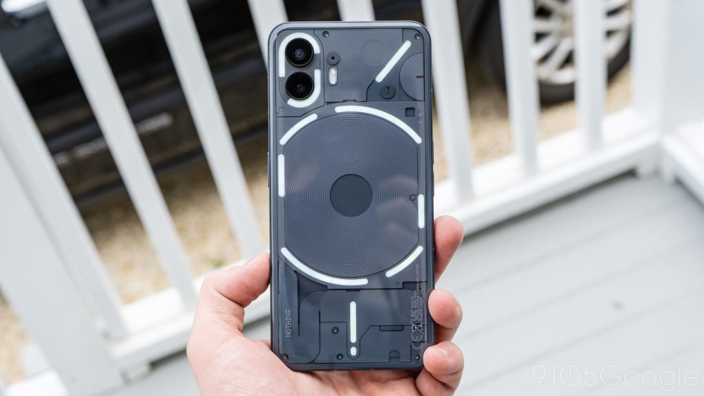
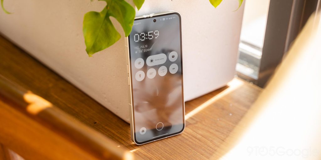
But you won’t feel those textures. Rather, the whole thing is covered in a glass plate that’s curved along the edges. It feels delightful in the hand, especially combined with the phone’s thinner design compared to its predecessor, and the flat edges meet the curved glass perfectly. It’s hard to describe accurately, but really, it just feels excellent in the hand.
Is a unique look enough to keep this device from feeling boring? Honestly, it just comes down to your individual taste. Nothing isn’t exactly reinventing the wheel here. It’s a nice coat of paint on the same old form factor we’ve been used to for years now. But that’s not a bad thing. Phone (2) feels familiar, and even as someone who’s really into foldables, it felt a little refreshing to use a well-done version of the “candybar” that’s been done so many times before.
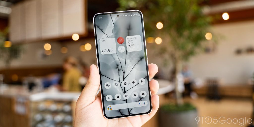
The display also lines up with this perfectly. It’s a 6.7-inch OLED panel at 120Hz, and it’s just plain good. The panel is easily bright enough for a sunny day without much trouble and has good colors and viewing angles. Plus, the fingerprint sensor embedded within is also fast and reliable. It maxes out at 1,600 nits of brightness, though there are notably no apps that currently support HDR on the device.
Overall there’s not much I can complain about here. The glass is even flat and has a screen protector pre-installed. I did notice one odd little bug with the display turning on in my pocket, resulting in countless accidental touches, but I’m sure this will be fixed quickly.
Glyph is a clever idea that’s still not useful enough
While the “transparent” look is Nothing’s unique style, “Glyph” is what attempts to set the design apart.
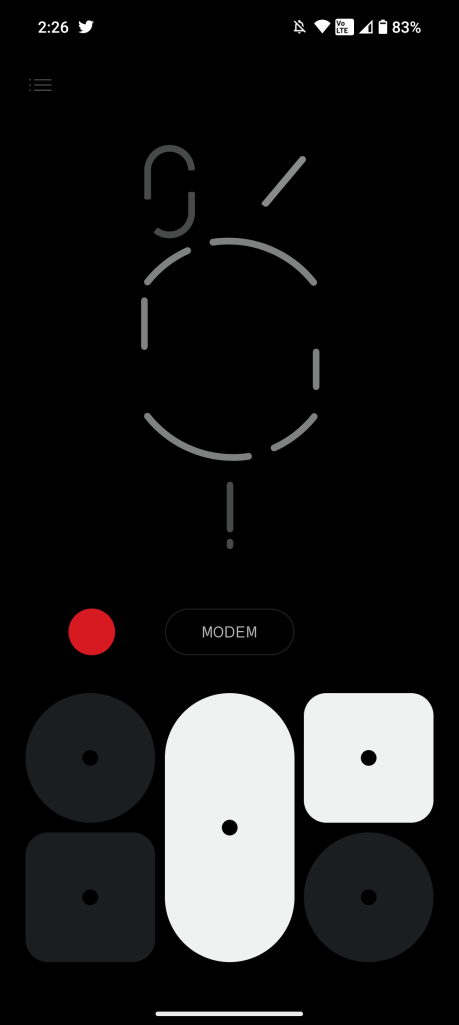
LEDs are placed throughout the back of the device, with a total of 33 zones that can light up together or individually. You’ll find lights around the cameras, the wireless charging coil, and also in a couple of other spots. Just from an aesthetic point of view, this is a cool design, and when they all activate, it truly does make the design stand out. The lights also, thankfully, serve a purpose.
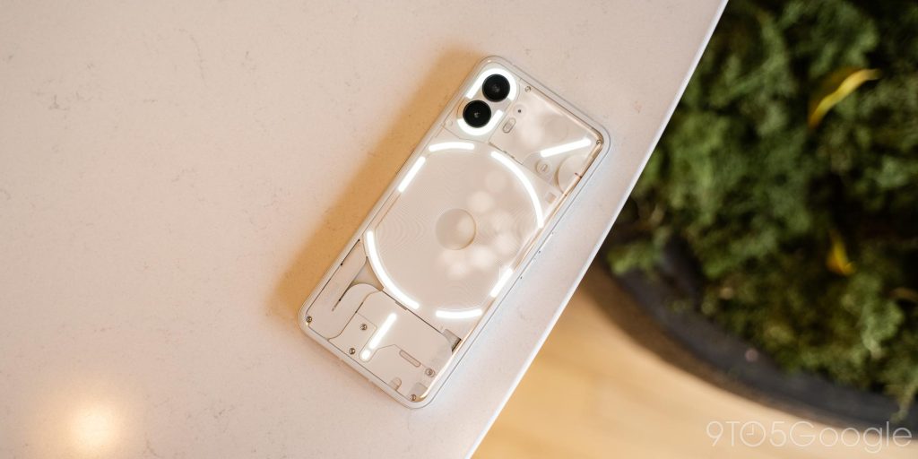
“Glyph” can be used for several functions, including:
- Light up to show incoming notifications when the phone is flipped over
- Show “Essential” notifications
- Use as a flashlight
- One red LED is used to show video recording
- Show timer status when the phone is flipped over
- Show Uber status (in beta)
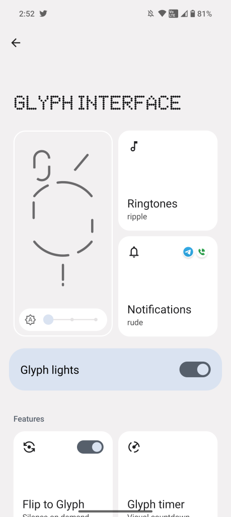
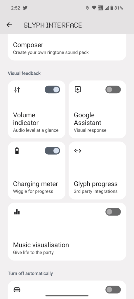
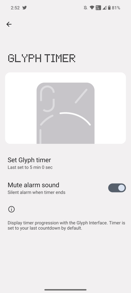
Those last two features rely heavily on the top right LED above the wireless charging coil. That strip, unlike most of the others, has enough individual LEDs to show gradual progress. The Glyph timer actually felt useful as a subtle way to show my timer constantly even without the phone’s screen on.
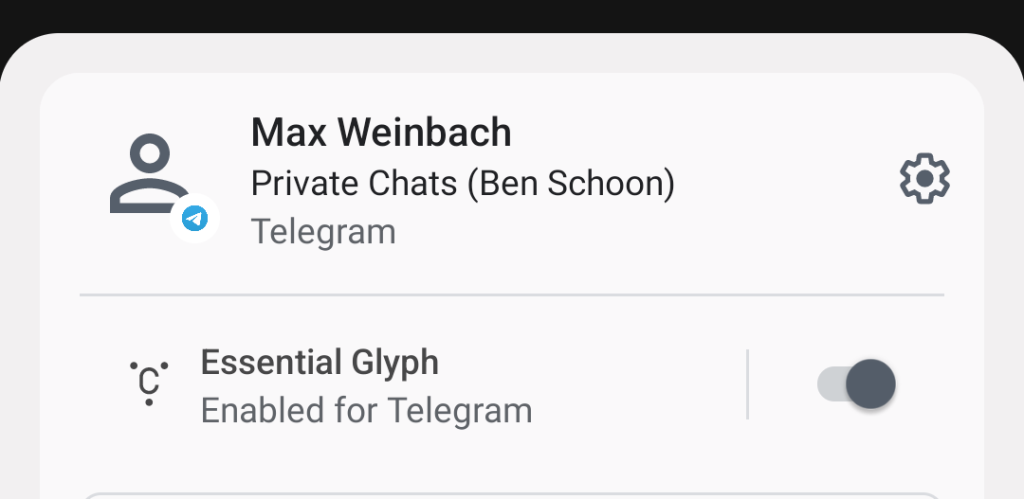
Another useful option is “Essential” notifications. This uses the LED in the top-right corner. When a notification is marked as “Essential” – this works either for an app as a whole or individual notifications, like specific messages, through the notification shade settings – it will light up that one LED until you next unlock the phone. It’s a nice addition, though I wish it could do more. I’d love to be able to map different notifications to different LEDs or add color to more easily identify them.
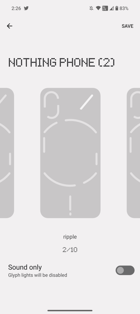
Other features here include a visible charging progress indicator when on a wired charger and a fully customizable ringtone maker where you can make a ringtone using pre-set sound effects that map to the LEDs. There’s also a hidden trick to enable a music visualizer (now using “Alakazam”), though it doesn’t work particularly well in my experience.
This is all very cool and somewhat fun, but I just wish you could do more here. Glyph was undeniably a gimmick on Phone (1), and while it’s much more useful on Phone (2), I still don’t think it’s quite good enough. More can be done to give this real utility. The timer is a step in the right direction, though.
Software & Performance
Nothing OS 2.0 feels familiar but is different in good ways
Like OnePlus before it, Nothing’s first device focused on offering a slightly tweaked take on stock Android that was fast and clean, and the sequel continues in that. However, this time around, Nothing touts that most of the software work is done in-house, and reports have shown that includes work from a lot of past OnePlus employees.
The short version is that Nothing OS 2.0, the company’s revamped skin on top of Android 13, is very good.
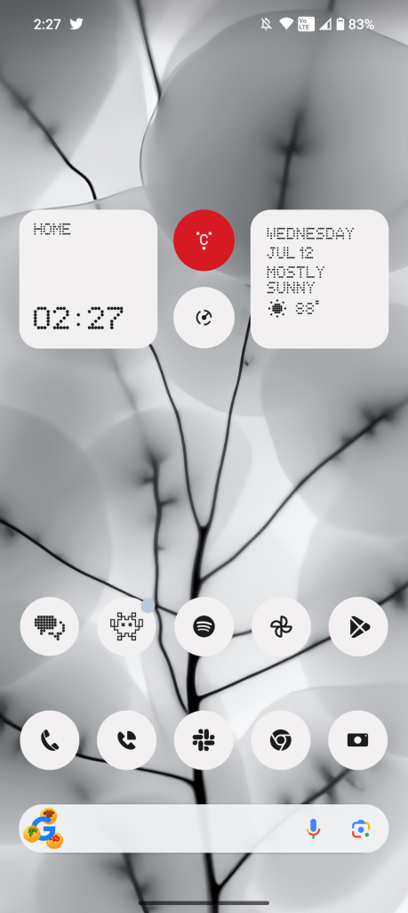
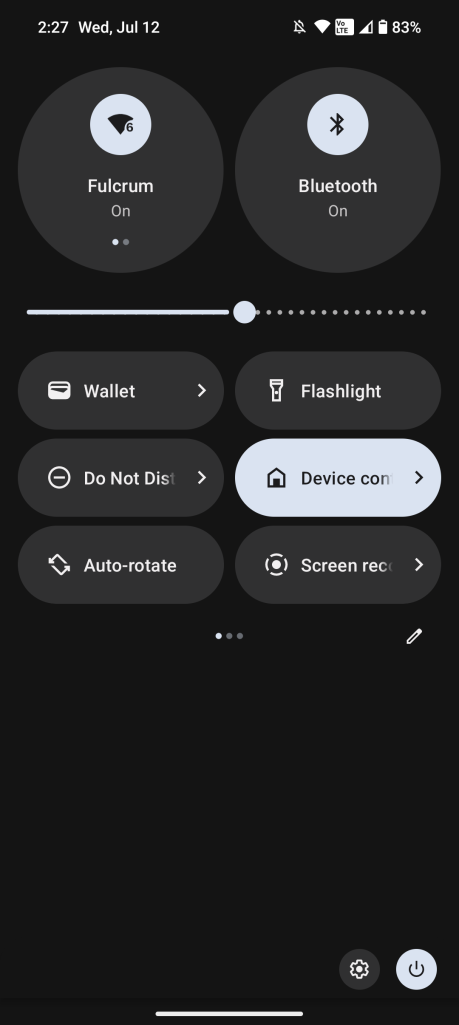
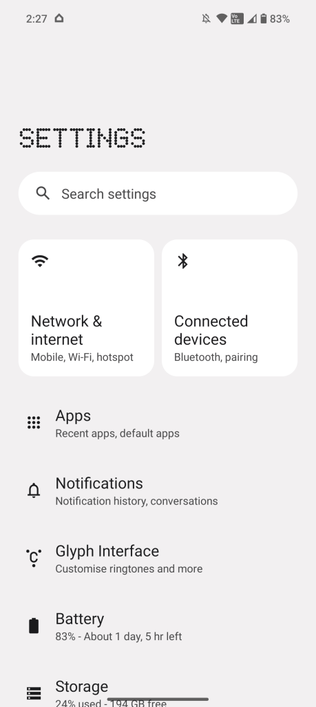
There’s nothing that feels out of place or bad here, it’s a clean UI that’s shockingly well optimized. My experience so far has been just as fluid as a Pixel but without many of the occasional bugs that tend to take Google’s devices down a notch. You’ll feel right at home coming from a Pixel or a OnePlus device before OxygenOS’ Oppo-fication, as Nothing hasn’t changed much.
Most of the alterations to Android in Nothing OS 2.0 come from a focus on “intentional use,” the company explained during a call, and this is felt in several locations.
For one, there’s the color palette. While you’re free to set your own wallpapers and take full advantage of Material You, the default settings encourage a monochrome look. I stuck with that through my review period and quite liked it.
This can also extend into your homescreen icons. Nothing built its own system for expanding Android 13’s themed icons to all of your apps (Google is also working on this), which can show them with a white or black look, depending on the current system theme. This further doubles down on the idea of “intentional use,” as having every icon look the same means you’re less likely to get distracted, Nothing explained. You can also optionally turn off icon labels or assign a single icon or emoji as the cover for a folder.
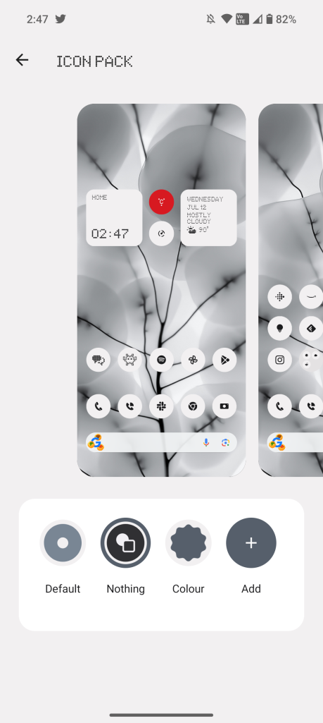
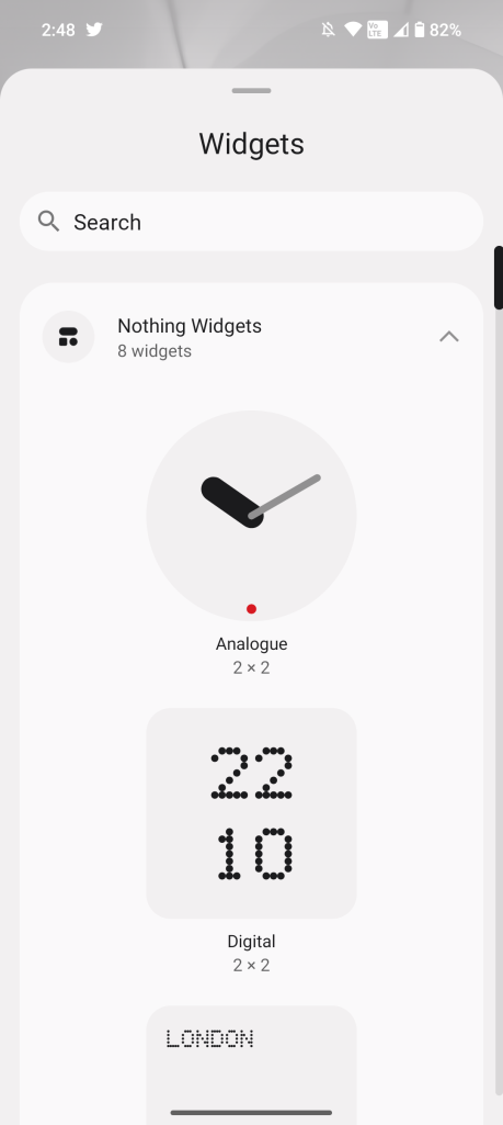
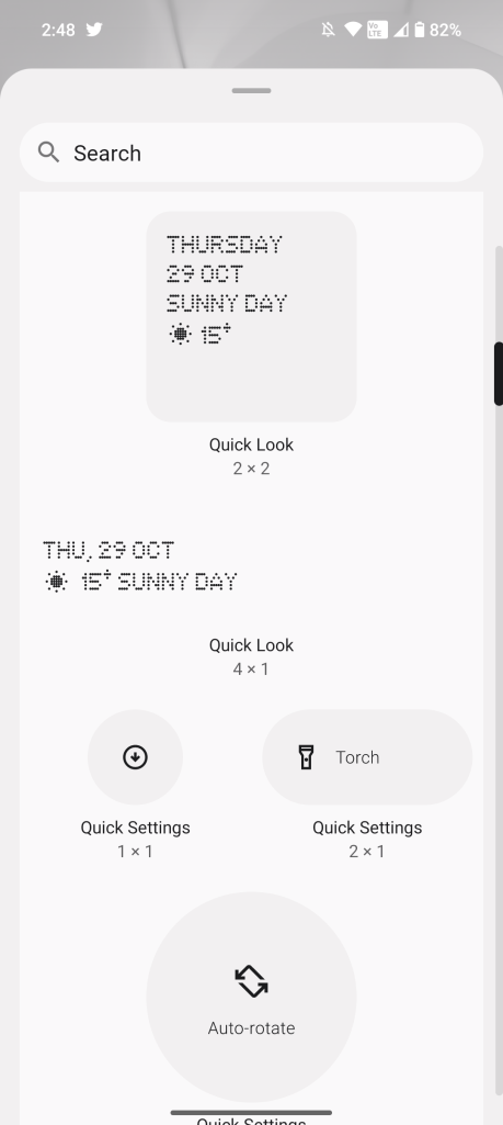
Another area where Nothing has built out custom software is the widgets. You’ll find a handful of custom widgets for the homescreen that can include the time, weather, and more. One even acts similarly to Google’s “At a Glance” widget, and there are others that can be used to add quick settings to the homescreen.
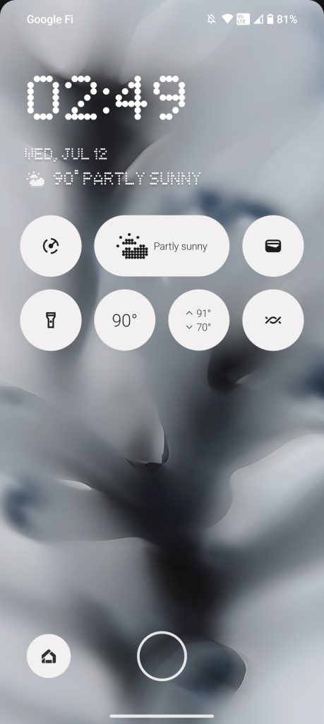
But Nothing also enables widgets to be used on the lockscreen. You’ll get a 4×2 grid that you can use with Nothing’s widgets (third-party options aren’t supported on the lockscreen). This is a welcome option, and it works really well with the always-on display, though I do wish Nothing had more useful widgets for this context. Over half of the widgets are just for the time, which is redundant on the lockscreen.
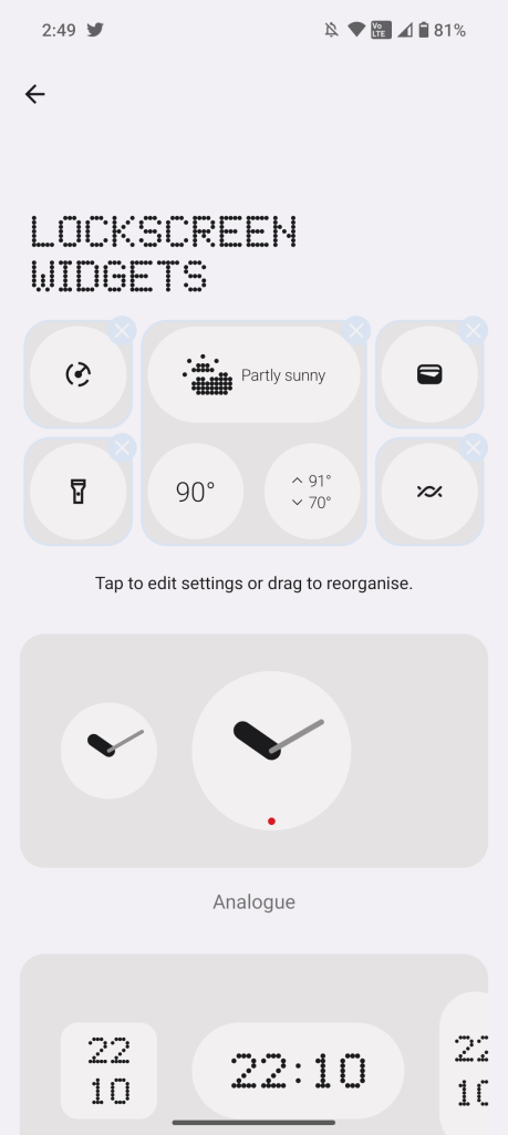
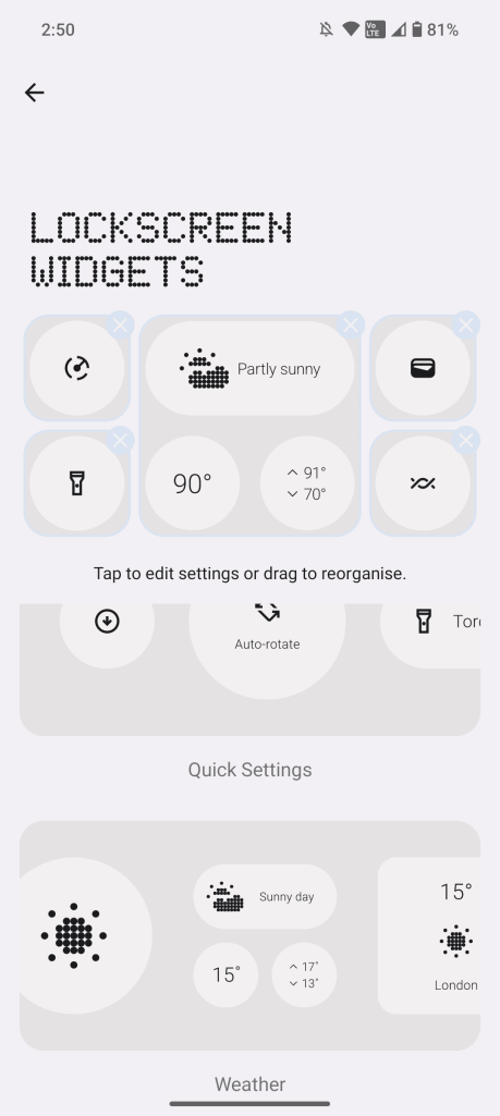
Bloat is also kept to a minimum. You’ll find Glyph controls as a top-level option in Settings, a pre-installed “Nothing X” app that works exclusively with the brand’s earbuds, and that’s pretty much it.
What I’ve really walked away with from this review, though, is just a sense of amazement at how stable and smooth Android is on this device. Normally, review periods are full of bugs because of unfinished software, but the Phone (2) has been arguably better than my Pixel and has also felt drastically smoother and cleaner than devices from Samsung and OnePlus I’ve used this year.
Sadly, there is one catch. Nothing doesn’t have the best software update policy. You’ll get three years of updates here, the same as Pixel, but only four years of security updates. Those security updates are also only delivered on a bimonthly basis, as opposed to the monthly schedule Pixel and Galaxy follow. Is that a deal-breaker? Absolutely not. It is worth noting, though, that due to the release timing, Phone (2) is scheduled to lose its updates in 2026 just weeks before a new version of Android is typically released.
Snapdragon 8+ Gen 1 is ‘outdated,’ but that doesn’t mean it’s bad
Under the hood, the Nothing Phone (2) is a big step forward over its predecessor. Where Phone (1) was definitively a mid-range phone on paper, Phone (2) brings a Snapdragon 8+ Gen 1 to power the experience. That’s the same chip found in OnePlus 10T, Galaxy Z Fold 4, and more, and it’s a stellar piece of hardware. It’s fast, powerful, and highly efficient in battery life, heat, and performance.
And all of those benefits translate wonderfully to the Nothing Phone (2). My review unit is the 12 GB/256 GB model, and it absolutely flies through anything and everything I throw at it. It’s smooth and fluid, and it does it all without even a bit of heat. Coming from a Pixel where Tensor often fries in the summer heat, the Phone (2) has been a delight.
Battery
Easily all day, if not more
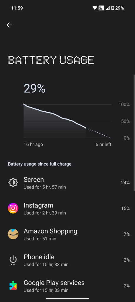
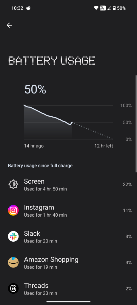
Perhaps the best aspect of Nothing’s chipset choice is how it affects battery life. With a 4,700 mAh battery, the Phone (2) eliminates any form of battery anxiety.
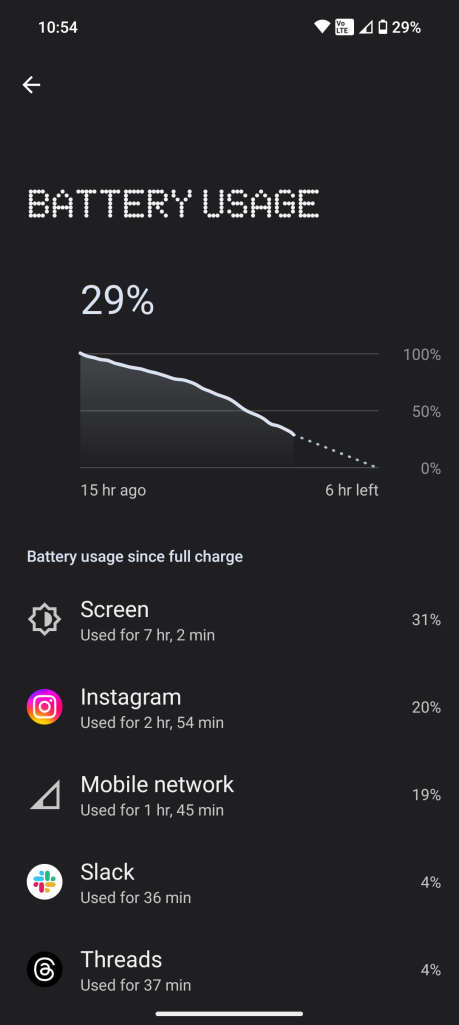
Throughout my testing period, I’ve seen incredible results here – easily 4-6 hours of screen time over a full day of use and usually with upwards of 30% left by the time I’ve called it a night. I actually found myself using the Phone (2) more than other devices I’ve been testing lately, and I think that’s partly because I never had to think about the battery life.
It has truly excellent battery life, and for many users, a single charge could probably stretch out for up to two days.
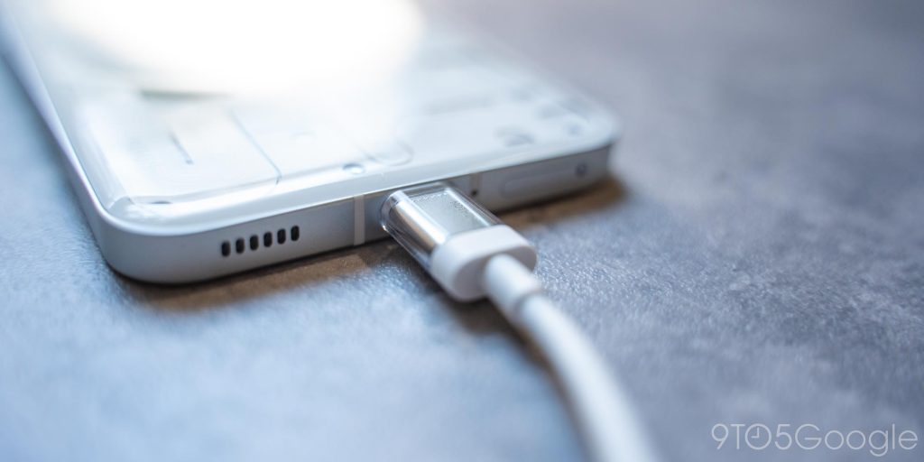
Charging is handled with USB-C at speeds up to 45 W. There’s no included charger, though, so you’ll need to buy your own. There is a sleek USB-C cable in the box that fits Nothing’s design language, and a matching power brick is sold separately for $35. Anything with USB-C PD will get the job done just fine, though, so you can probably use whatever you already have on hand.
I’m also happy to see wireless charging included at this price point. It’s limited to 15 W, but it’s plenty speedy, and given how long a charge lasts, it’s an afterthought anyway.
Camera
It’s no Pixel, but it’s quite good
New phone brands often fail when it comes to the camera, and even established names can even struggle at times. Nothing, though, has really nailed it here.
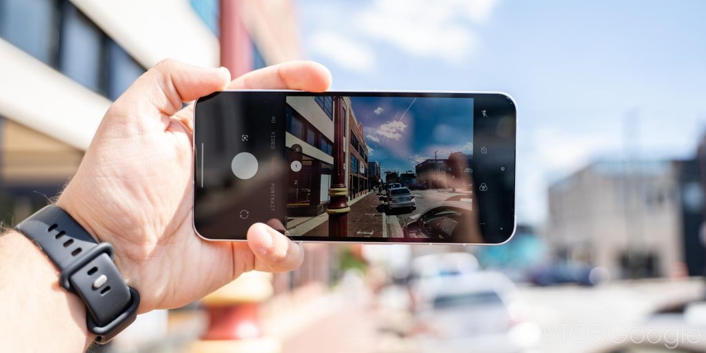
The duo of 50 MP cameras on the back of the Phone (2) pump into a custom camera app that’s clean and easy to use, and the results speak for themselves. Shots are crisp, have plenty of contrast, and don’t overdo it on saturation. I can’t say I’ve been impressed with the photos I’ve taken, but I’m very rarely disappointed. Rare issues with autofocus or the occasional bit of motion blur can hurt a photo, but I’m shocked at how happy I’ve been. Even the video quality is quite good (see the full-size sample link below).
As for the selfie camera, it’s a mixed bag, as on any Android phone. The 32 MP front-facing camera is… fine, but it lacks auto-focus as usual. Our Max Weinbach explains:
The selfie camera is what you expect from any Android manufacturer that wants a high- megapixel camera without auto-focus on it. It’s simply ok. Video recording is fine at best, photos are alright, but nothing outstanding. It’s just fine.
The lack of autofocus isn’t as noticeable as other devices, which could be due to the fact that the quality isn’t there in the first place. I don’t think anyone will be upset with the selfie shooter, but no one is going to be particualrly happy with it either.
Nothing’s camera experience feels remarkably close to a Pixel in that it’s a camera you don’t have to think about. I trust it to take the shot I want. It doesn’t have nearly as many features as Google’s suite, but it gets the job done well.
I particularly want a telephoto lens next time around. That’s where this phone is lacking, as zooming in just doesn’t hold up past 2x. Nothing told me that the dual-camera setup was the right “balance” on design and price, but I’d like to see this revisited next time around.
Tidbits
I don’t like Nothing’s ringtones
One of Nothing’s big pushes with Phone (2) is a collaboration with Swedish House Mafia for creating custom ringtones. There’s a fun interface for doing this, and its syncs with the lights on the back. But, try as I have, I just can’t get into it.
Even the built-in ringtones on Phone (2) are just not my cup of tea at all. They’re harsh and too robotic. It’s jarring when the sound is on, and even when you turn it off, the vibration patterns are just annoying at times.

The haptics are not great
And that brings us to the haptics, which are not great. It may partially just be how Nothing uses the motor, but the haptics feel loose and rough. They’re not tight and refined like on a Pixel and even more so on an iPhone.
It feels like the hardware might be there, but in the current implementation, I’m just not a fan.
US network support comes up just short
Where the Phone (1) was built entirely without US networks in mind, the Phone (2) has to make up for that, given it’s officially sold stateside. My testing on Google Fi was without any hiccups, with strong coverage that was in line with other Snapdragon-powered devices I’ve used this year. Phone (2) would hold on to a connection better than the Pixel Fold I was usually carrying alongside it and do so with less heat from the modem.
That said, there is a gaping hole here. Nothing tells us that Phone (2) is only certified at this time for use on T-Mobile and AT&T networks. There’s no Verizon certification, and it’s not even a guarantee it’ll work through the carrier’s “Bring Your Own Device” program. In theory, you shouldbe able to use Phone (2) on the Big Red, but you might run into some hiccups during activation or in some scenarios. To avoid any potential issues, I’d lean towards not buying a Phone (2), at least for now, if you’re on a Verizon-based network.
Don’t forget to look at the big picture
The Phone (2) is really good, but one thing that’s easy to overlook is what surrounds your phone.
As a young brand, you, as a consumer, will have to deal with some trade-offs when buying this device. That includes lesser access to repairs, as Nothing doesn’t offer the same walk-in options in the US as you’ll find with devices from Samsung, Google, and of course, Apple. Accessories are also at a minimum. Nothing sells an official clear case and a screen protector, but third-party options are slim – though Spigen is teasing some special options.
Even at the point of purchase, Nothing doesn’t offer trade-ins or financing. Without any carriers in the mix, too, it means options are even more limited for buying.
Nothing Phone (2), Pixel 7, or OnePlus 11?
At $599 each, the Nothing Phone (2) and Pixel 7 are obvious competitors. And, to me, it’s a hard choice between the two.
It’s a list of pros and cons.
With the Nothing Phone (2), you get the strong and stable Snapdragon 8+ Gen 1 chip, which is objectively better than Tensor G2, as well as a unique design and a fun party trick in Glyph. But with Pixel 7, you get speedy updates, a near-constant barrage of new features, and the most reliable camera in a smartphone today. Realistically, picking between these two phones just comes down to what you value most.
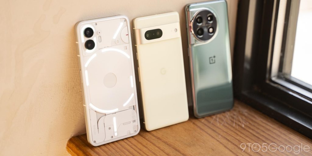
And, beyond that, there’s also the OnePlus 11 at just $100 over the Phone (2). With that, you’re getting a faster chip and faster storage, a camera system that adds a telephoto lens, and again, a device that just has more to say. Plus, it’s been heavily discounted as of late.
Final Thoughts
Nothing Phone (2) is a very good phone. That’s really what it all boils down to.
There’s nothing going on here that’s impressive or groundbreaking, or even really all that exciting. The Phone (2) isn’t suddenly making “candybar” smartphones fun. It’s just a really good phone with LEDs on the back – a jack of all trades but a master of nothing in particular.
That doesn’t make it bad, though. In fact, I’d say it’s just to the contrary. And, for $599, you’re not making a huge gamble either, as Phone (2) genuinely does offer an experience that can beat out devices twice its cost.
But it’s all going to come down to your personal priorities at the end of the day. Phone (2) is stellar, but the young company has a ways to go to truly compete with the rest of the market. With this only being its second release – and its first in the US – Nothing is setting a fine foundation, and I’m eager to see where its roots go next.
Nothing Phone (2) is, for now, exclusively available from Nothing’s website in the US and available at select retailers in other regions.
Max Weinbach contributed to this review.
FTC: We use income earning auto affiliate links. More.


